The 'D' stands for 'dumb' in Drake battle with DMACC over block letter use
The conflict over two low-design logos is beneath both institutions
Two Des Moines institutions of higher learning are working hard to make the letter ‘D’ stand for “dumb.”
Drake University, my two-time alma mater, is suing Des Moines Area Community College over the use of the letter ‘D’ as a brand.
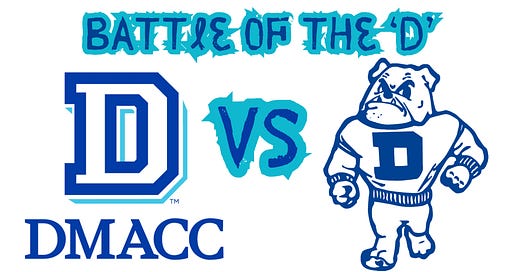
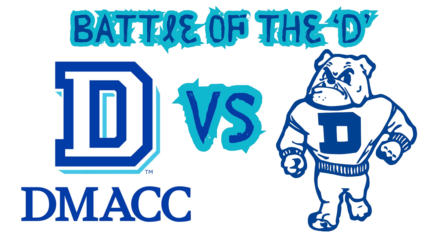
DMACC rebranded itself last year and started using a block letter ‘D’ in royal blue, outlined in white with a sky-blue shadow.
Drake also uses a block letter ‘D’ as part of its brand, theirs a darker blue on a white background.
Drake argues the junior college’s ‘D’ infringes on their distinct and defining ‘D.’
“‘D’ for us is Drake, and has been for the totality of our existence,” Drake President Marty Martin wrote to DMACC President Rob Densen, per court documents. “‘D’ for you is ‘Des,’ and thus, does not have the same essentiality for you as it does for us. The ‘D’ is our identity.”
Drake is named after Francis Marion Drake, a Union Civil War general and former Iowa governor who gave railroad bonds to fund the opening of the school in 1881.
Iowa lawmakers created DMACC as part of a sweeping education bill in 1966, with students arriving for their first classes on the school’s Ankeny campus in 1968.
Brands are important to schools and businesses, but there’s no way Drake avoids looking petty here.
I’m not sure what the confusion is.
If you’re at an event on DMACC’s campus, the ‘Ds’ you see are probably for DMACC.
The' Ds' are probably for Drake if you watch a volleyball match or basketball game at the Knapp Center.
I suppose the problem is when people are out in the wild wearing unspecified ‘Ds.’
A confused public could become disoriented, discombobulated, or otherwise discountenanced.
“Say, Doris, is that fellow over there with the ‘D’ on his sweater a supporter of Drake or DMACC.”
“Well, Dean, I just don’t know. Those ‘Ds’ are so hard to tell apart. It distorts the senses.”
“Never mind, Doris. The guy has the dubious distinction of being a Dallas Cowboys fan.”
In court filings, DMACC officials responded to ‘D’-dilution claim with a snappy comeback: “Drake simply does not own the letter ‘D.’”
Obviously.
If it did, the administration wouldn’t have had to cut three academic programs (albeit tiny ones) to balance its budget.
Imagine the royalties Drake would see from “The Simpsons” every time Homer drooled over donuts.
But how far do Drake officials plan to take this?
Should we warn Dallas Center-Grimes, Dowling Catholic, or even the city of Des Moines? What should fellow universities such as Duke, Davidson, and DePaul do? Can “Sesame Street” no longer be brought to you by the letter ‘D’ unless they mention Drake?
Don’t laugh. Higher education institutions have been known to be downright dastardly over logos.
In 2006, Waukee High School rolled out a purple and gold logo that looked like the University of Wisconsin letter.
Wisconsin, a school where officials have no fear of looking petty, sicked their lawyers on Waukee.
The Dallas County public school gave up and spent several thousand dollars removing the logo from courts, fields, vehicles, and letterhead.
Looking at both ‘D’ emblems for Drake and DMACC, one hopes neither school spent much money on their signature monogram.
Both look like something cooked up by a D-minus student in a first-year graphic design class.
Either school could have tried a script ‘D,’ but that would cause even more problems.
Any students or alumni under 45 don’t know how to read cursive.
I worked at Drake in 2006 when the university rolled out a fancy new logo, designed by an outfit that had made Super Bowl logos.
That logo has a fancy swoosh on the top of the ‘D’ for both academic and athletic marks.
I could understand Drake pooh-bahs getting salty about DMACC copying that logo.
That one is distinctive.
But going to court with DMACC over block letter ‘D?
It feels dogmatic.
It’s not as if Drake has always kept a bright shine on its ‘D.’
In 2010, Drake rolled out a recruiting campaign called ‘D+.’
The campaign was so poorly thought out that it appears in marketing textbooks under “what not to do.”
Ad Week mocked the campaign, saying it “seems to position Drake as a school whose standards barely exceed total failure.”
Drake responded with a not-at-all defensive statement to alumni and donors saying officials believed future Drake students would understand the irony of the campaign.
Maybe, but D+ soon quietly disappeared.
One hopes the same of this lawsuit.
Drake and DMACC are both cornerstone instructions in Des Moines. This dispute is beneath both schools.
The Iowa Capital Dispatch reports the two school’s marketing departments debated the ‘D’ dilemma.
The fates divined this discussion amongst a den of delegates were doomed to failure and disbanded without a detente.
Thus, Drake decided the courts would issue a final decree.
Let’s hope both schools take a lesson from history.
In 2006, when Wisconsin put the smackdown on Waukee over the ‘W,’ Carlisle schools used an athletic logo like the Wildcat used by Kansas State University.
Worried they might face a similar conflict with K-State, Carlisle officials contacted the Manhattan, Kansas, institution.
K-State officials responded to Carlisle: They could use the Wildcat … for an annual fee of $5.
Denson and Martin should flip a coin to see who pays.
Daniel P. Finney is a member of the Iowa Writers Collaborative. Please visit their page to see a full roster of writers and consider subscribing to their columns.


Nice analysis! When you used the word “dogmatic,” it gave me an idea. Maybe the Drake Times-Delphic should start an editorial column “Dogma.”
Reading about the lawsuit, first thing I thought of was the cursive, stylized letter 'D' and why Drake didn't use that particular design in ALL their ads. When I see that cursive 'D' I immediately think of Drake University. As I'm certain others do. I knew nothing of the history, it being designed back in 2006. I just know that, for me, it represents 'Drake' in a unique, positive fashion.